|
JOURNAL OF GREAT WATERS ASSOCIATION OF
VEXILLOLOGY
December 2006
Vol. XI, No. 2, Issue 22 
REGION=S
NEW CITY FLAGS SHOW CONTRAST
At least three
municipalities in the GWAV region have recently adopted new flags: Chagrin
Falls, OH; Livonia, MI; and Middleburg Heights, OH.
 |
The first of these
contrasts greatly with the other two, which are more traditional in design.
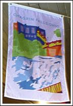
The flag of Chagrin Falls not only departs from tradition
in design, but
also in its shape. The flag is displayed vertically rather than
horizontally, suspended from what would be the hoist in the traditional
format. Its design is also radically different, and difficult to describe.
The field of the flag is white. (The flag as pictured appears to
have lavender shadows, but this was due to the shadows in the room where
it was hanging.) A colorful scene of the village center shows a
building (blue with lavender
windows with green foliage below it), and a red and yellow bridge and
walkway that cross the Chagrin River and the eponymous falls
(blue waves on white). At the top, near the
Ahoist@
position, and centered, is CHAGRIN FALLS OHIO in blue. The
design is remarkable because it uses all 3 primary and secondary
colors, and 2 shades of green and orange, as well as 3 different
shades of blue. The whole appears to be
a poster on cloth; as a poster it
would be quite attractive, but as a flag it is unusual, to say
the least. The flag was designed by Pam Premulli, a graphics
designer in the village, and adopted by the village council
November 28, 2005 |
Y/B:
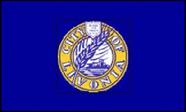
Livonia, Michigan |
Y/B+:
Middleburg
Heights, OH |
The flags of
Livonia and Middleburg Heights have the same design concept: the city seal
in yellow on blue. Livonia=s
field is a medium blue,
described as a
Adusty
blue.@
The seal=s
diameter is 5/12ths of the flag=s
width, and set in the center. The seal has an inner ring of golden yellow,
at the top of which is a small heraldic shield in white with IN GOD WE TRUST
in small blue letters, legible only on large flags. Curved on the
golden
field of the ring on the hoist side of the shield is the word CITY, on the
fly side is OF, and curved below, counterclockwise so as to be easily read,
is LIVONIA, all in white capitals outlined in blue. The center of the seal
has a white field, depicting a modern skyline along a lake, with a stalk of
wheat,
symbolizing the city=s
agricultural past, running from the outer edge of the seal between the
AI@
and
AV@
of LIVONIA across the center to the outer upper edge immediately before
AOF,@
all in blue. The flag=s
proportions are 3:5. It was designed by a local graphic artist, Van
Nazarian, and officially dedicated
on May 27, 2006.
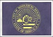
Middleburg
Heights=
flag was years in development. This author, a city resident, had advocated
for a long time for a city flag, but urged some
design not employing the
complicated seal. Nevertheless, the city so identifies with the seal that
nothing would do but that it be placed on the flag.
(Another likely
influence was the fact that 3 of the cities bordering Middleburg HeightsC
Berea, Brook Park, and StrongsvilleC
all use the city seal
on a plain field.)
The field of the
flag is a dark blue, with the seal=s
features in yellow. The seal occupies most of the center portion of the field;
its diameter is
4/7ths of the width. In a ring outlined in yellow around the
seal=s
outer edge and curved over the top from center to center is
CITY OF MIDDLEBURG
HEIGHTS. A small yellow 5-pointed star before and after these words separates
them from the legend below,
placed counter-clockwise: STATE OF OHIO
iU.S.A.
A very narrow double ring encloses the main design of the seal. The bottom
third shows a
section of the US flag, 9 stars and parts of 5 stripes visible.
The flag=s
top edge forms a base for the remainder of the design. From the hoist is a barn
and silo, a modern office building, and smaller buildings representing homes and
the Recreation Center. Superimposed in the center are 3 onions,
complete with
roots and stems, that extend slightly below the flag=s
upper edge. Behind this display, in the center is a rising sun, about half of
which
is visible, with 22 rays emanating from it to the inner edge of the seal.
On the hoist side, at the 5th ray, is an airplane flying toward the
fly, symbolizing
the city=s
proximity to the Cleveland Hopkins International Airport. The barn, silo, and
onions recall the city=s
agricultural past as a center for onion
cultivation; the remainder of the
buildings denote the unity of business, community and family. The seal was
designed by James J. Modarelli,
a resident of the city, in 1977. The flag was
adopted by City Council on July 25, 2006.
}
(JP)
|